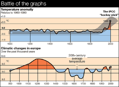
The graph below show a “before” (with the UN data manipulation) and “after” (removing the fudge) view of historical temperature variations… It sort of casts things in a different light (bear in mind that temperature measurements prior to the 20th century are suspect, even without “correction” factors).